UX DESIGN • UX RESEARCH • UX WRITING
Website usability improvements for AMA Colorado
How a usability study and site redesign positively impacted user experience
Project Duration: 3 months
Summary
The American Marketing Association, Colorado chapter (AMA Colorado) helps local professionals build their careers and network with other members in the area. Its website is the single place of truth for membership and event information.
As a Board Member of AMA Colorado, I led a research study identifying how to improve website engagement and overall user experience.
Skills + Tools
• User research
• Heuristic analysis
• Content auditing
• Wireframing
• Prototyping
• Figma | Google Suite | Hubspot
Team
• Myself
• AMA CO board members
Problem
Every month, I analyzed AMA Colorado’s website user behavior to understand if the website helped the chapter reach its goals. The data consistently showed low page engagement and low conversion (event signups) month-over-month.
Solution
Redesign site navigation, main web pages, and core functionality to improve content hierarchy, usability, and navigation.
Identifying the issues
For this study, I aimed to identify and fix any website usability issues that prevented visitors from accomplishing their goals. This, in turn, would hopefully improve key chapter metrics including event attendance and new member sign-ups. Before designing new solutions, I started with three different types of research.
Individual analysis: To identify potential issues, I started with heuristic analyses and an in-depth content audit to form initial hypotheses about usability issues.
User survey: I then surveyed users to understand their intent and develop personas. Insight from this included member and non-member demographic data, ranked user priorities, and current frustrations. This data was used to develop personas.
Usability testing – current website: The final stage of research was usability testing on the current website with 2 former members and 3 current members. These interviews provided baseline data on task completion rate, time to complete tasks, and general user opinion.
User feedback identified three key areas of frustration:
Broken and/or duplicate navigation menu
Outdated content on event pages
Missing site functionality (e.g. search, forms, CTAs, etc.)
Testing a new website design
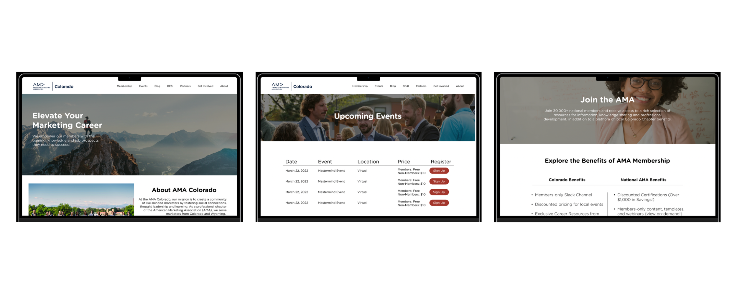
Based on data collected during research, I redesigned the Home, Events, Blog, and Membership pages as well as the main navigation. I then created a basic prototype in Figma for further usability testing with two users.
Prototype Testing Highlights
Reduced time to complete tasks by 82% on average
All participants agreed the website was easier to navigate
All participants agreed event information was easier to understand
Recommended updates
Renaming main navigation titles to remove vague, industry-specific terminology
Reformatting page structure to improve readability, highlight the most relevant content, and remove outdated information
Adding key functionality such as a search bar, updated contact forms, and removing unnecessary clicks from the Membership signup flow
Results
During prototype testing, design updates reduced time spent searching for information by 76%. Recommended changes were then implemented on the live AMA Colorado website.
This study was conducted as part of a course in the ASU M.S. in User Experience program. Read the full report write-up here.


