UX/UI DESIGN • USER RESEARCH
Redesigning an MVP to improve usability and user experience
Achieve your goals with Executely – a generative AI platform that helps you define, plan, and accomplish anything
Summary
Executely (now GoalDay) is a pre-seed startup building a generative AI goal management platform. As a team of one, the founder launched the MVP and conducted user research before bringing on designers to improve the user experience.
My role on the project focused on completing user research and defining user needs, auditing current user flows and key interfaces, designing and testing new interfaces for onboarding, the core product, and new features.
Project Length: 2 months
Skills + Tools
• UX/UI design
• User research
• Problem definition
• Wireframing
• Prototyping
• Developer handoff
• Figma | FigJam
Team
• Founder
• 3 UX Designers (including myself)
Problem
The initial MVP was not user friendly or intuitive. In initial user interviews, users noted that the concept was interesting, but there were many usability and design issues.
Solution
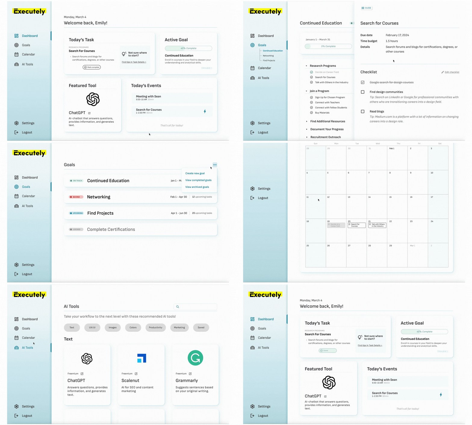
Our team redesigned key user flows based on initial research. I focused on the core product, especially the main Dashboard, Goal and Task details, and Calendar pages.
CHALLENGES ALONG THE WAYChallenge: Founder regularly changed product requirements and design asks.
Solution: I asked for additional information and context when these situations arose. If we agreed on the necessary changes, they would be included in design iterations.
Changing scope
Challenge: User recruitment for discovery interviews was challenging, outreach received a minimal to no response.
Solution: During the Design stage, we expanded our potential audience to include more user personas. For usability testing, I then had a wider pool of potential users to contact and received higher response rate.
User research recruitment
Challenge: As a new team, had no prior relationships or understanding of working styles.
Solution: As a team we established consistent meetings to review work and collaborate, overcommunicated on Slack, and regularly asked for feedback. This ensured we were aligned as we moved forward in design.
New product team
Challenge: When creating low-fidelity designs, we spent a lot of time designing our hopes and dreams for the next product version.
Solution: As designs progressed, I eliminated features that would be added to the roadmap for future development. This streamlined the design process and refocused my designs on necessary user features.
Slow start to design
MVP REDESIGNCreating a more intutive, usable product
Executely MVP designExecutely had an existing MVP that the Founder had used it to conduct initial user interviews and gather feedback. It was clear that onboarding and the core product needed redesign. When I joined, I was eager to start designing - but first, we took a step back and asked a few key questions:
How might we make onboarding easy and intuitive while gathering information about the user?
How might we make it easy for users to navigate Executely so they can return to goals and measure progress? (my focus)
Asking these questions allowed me to think through different design options to identify the best way to solve our user’s problems.
A new and improved product backed by user insights
We started this project with research. I dove into user interviews conducted by the Founder to tag insights and identify the biggest areas of opportunity.
Here are a few insights directly from users pre- and post-Executely:
The MVP was bulky and hard to navigate
Users expected an intuitive interface and elevated look (“like Apple”)
Progress tracking was a “must-have” for users
Based on this information, I started iterating on new designs.
Prioritizing user goals and needs in FigJamA few design iterations
Designing an intuitive, user-friendly platform
I focused on redesigning the core product, which included screens and interactions for the following screens:
Dashboard
Goals Overview
Task Details
Calendar
Schedule Genie
Account Settings
I also prototyped the new user onboarding, which included updating content and designing interactions.
Putting the new design in front of users
The final step for this project was usability testing. I conducted 6 user interviews over one week, iterating the design every two sessions.
Making changes frequently allowed me to confirm assumptions and understand if the changes improved the user experience.
After completing all sessions, I compiled a report and shared it with the Founder for documentation
Five major research findings:
Users wanted more specific tasks and guidance when completing tasks
67% of users expressed interest in having event details shown in the ‘Calendar’ tab
50% of users want the ability to sync multiple calendars (work vs. personal, etc.)
80% of users mentioned wanting to collaborate with others on goals and tasks
All users were intrigued by the Schedule Genie feature that helped schedule time to complete specific tasks on their calendar
Results
Once usability testing was complete, designs were adjusted once more before developer handoff. This product is currently in development.


